Simple App that Manage Business Payments with Connected Banking
This is the story of how we transformed the OpenMoney mobile app to empower businesses with connected banking for seamless payment management. The redesign led to a 50% increase in customer retention, a 40% reduction in churn, and improved user satisfaction through innovative, data-driven design.
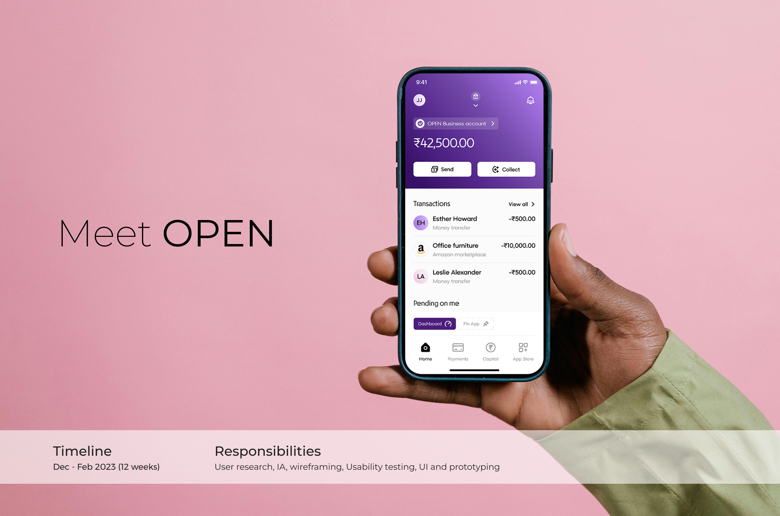
About OpenMoney
OPEN goes beyond basic money management for businesses. It allows owners to seamlessly connect their existing accounts for pay vendors, receive payments, and reconcile effortlessly.
Open has other tools that required to run a business smoothly like create bills and invoices, payroll, accounting, and payment gateways etc...
Understanding the problem space
You started a business with one current account 🏠
Your business grew and had multiple branches in different cities 🏢
You opened different bank accounts to manage finances easily 🏛️
Business boomed, requiring invoicing, billing, payroll, and accounting tools 🛠
You're finance team stuck with disconnected tools wasting time on reconciliations 💻
You, as a business owner/CFO, do not have access to all the information required ❌
And this is what we set out to solve 🙈
Business owners / CFOs are frustrated with switching between different platforms that don't communicate with each other, resulting in a lack of consolidated data, making it difficult to make informed business decisions.
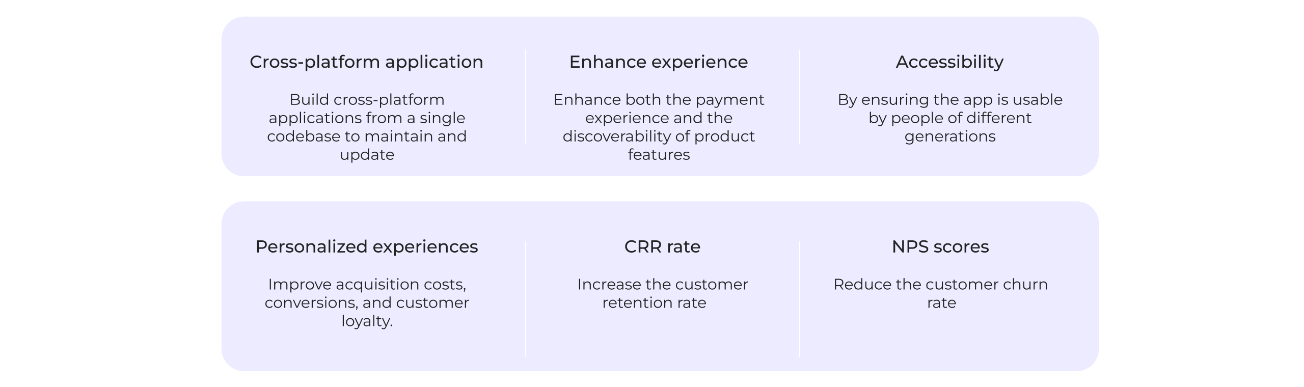
Business Goals
While designing, we ensured that fulfilling the business goals was a top priority.
Assessing & benchmarking UX
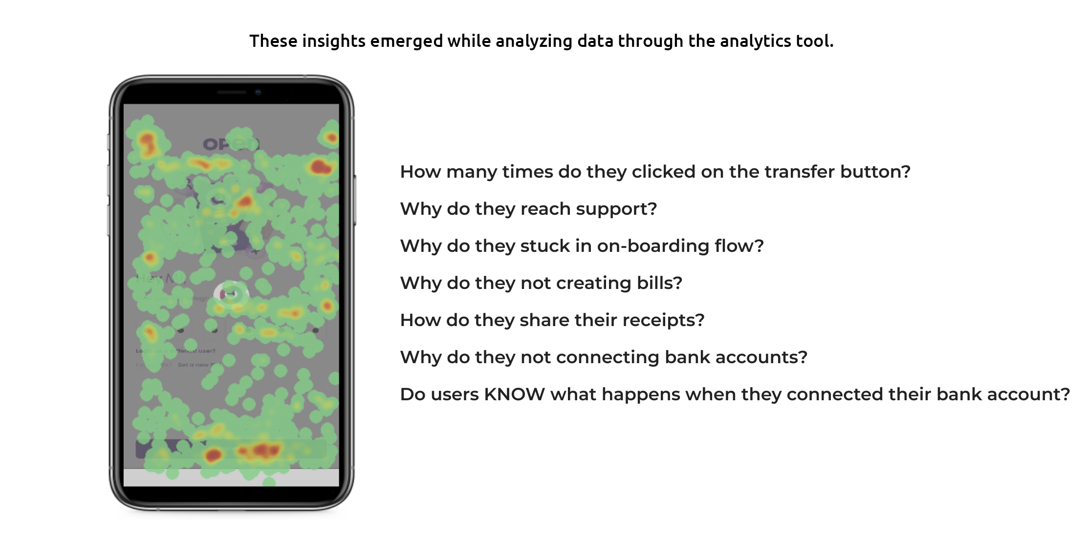
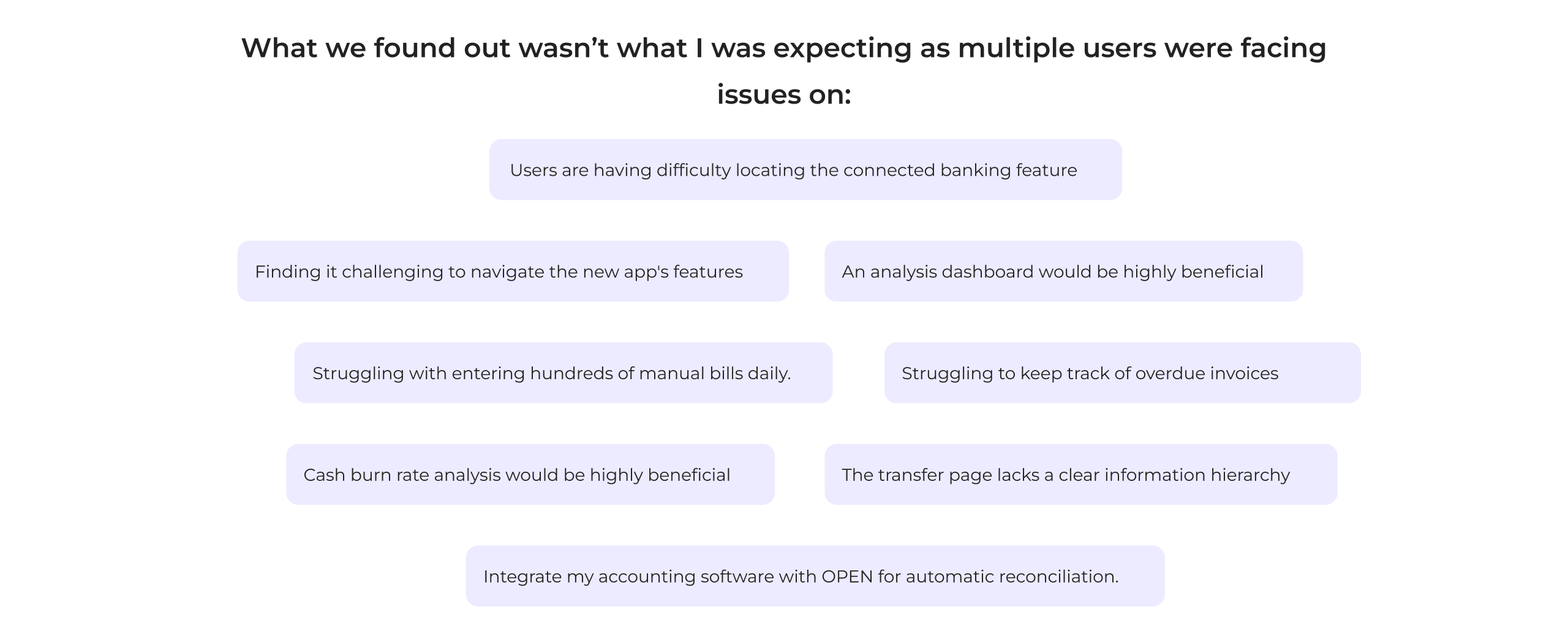
We started with User Research, by creating a questionnaire and conducting small interviews with users, we also went through analytic tools to check the existing user journey.

- Revolut stands out for its wide range of features and global usability, but its crowded interface and reliance on paid features could overwhelm some users.
- N26 excels in simplicity and minimalism, focusing on core banking with a clean, easy-to-use app, but lacks the advanced features of competitors like Revolut.
- RazorpayX is highly specialized for business users, particularly in the Indian market, offering robust tools for managing finances, though its focus on business banking limits its consumer appeal.
Each app has strengths tailored to different user needs—Revolut for a feature-rich experience, N26 for simplicity and core banking, and RazorpayX for business-focused functionalities.
Information Architecture
The task has now shifted to designing a new Information Architecture (IA). With solid data and initial ideas in place, thorough validation is essential to ensure a positive impact on user experience.
Decisions
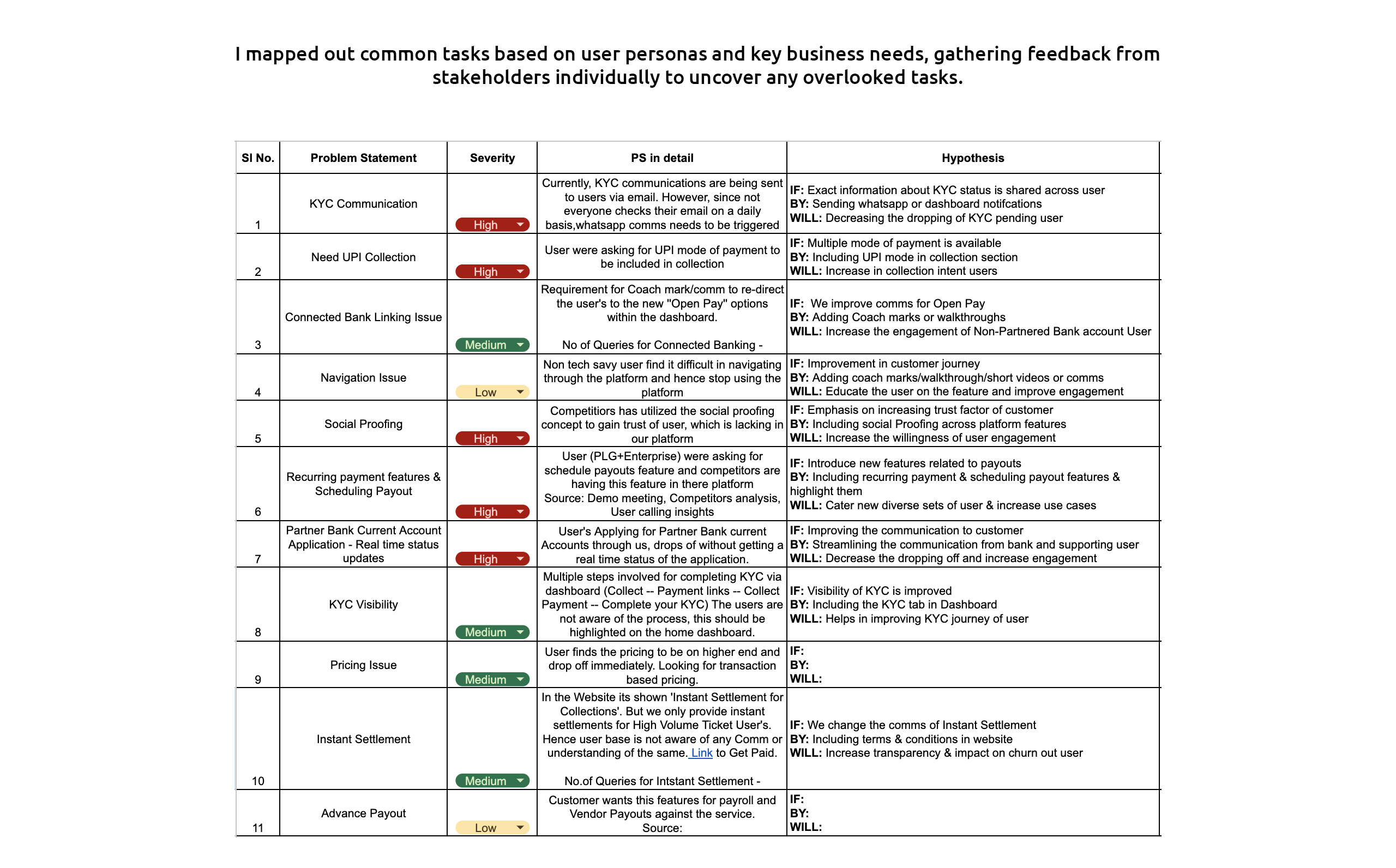
After collecting user pain points and my own observations, I’m now ready to move forward with wireframes. I’ve documented all the suggested improvements and combined them with my insights to create rough drafts. I experimented with various versions, exploring different layouts and element placements. This is part of my process, ensuring the final product offers the best user experience and an intuitive, easy-to-use solution.
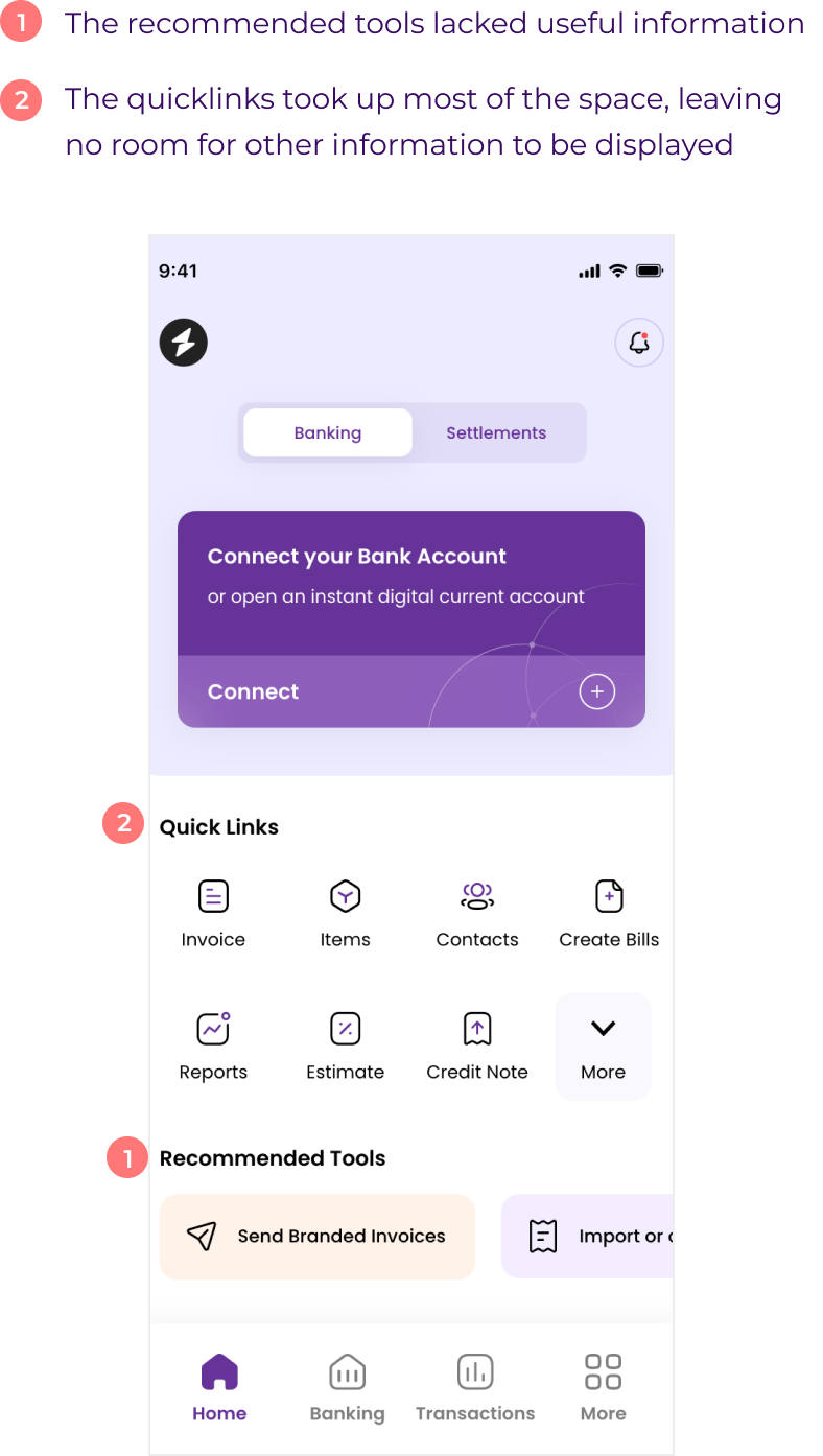
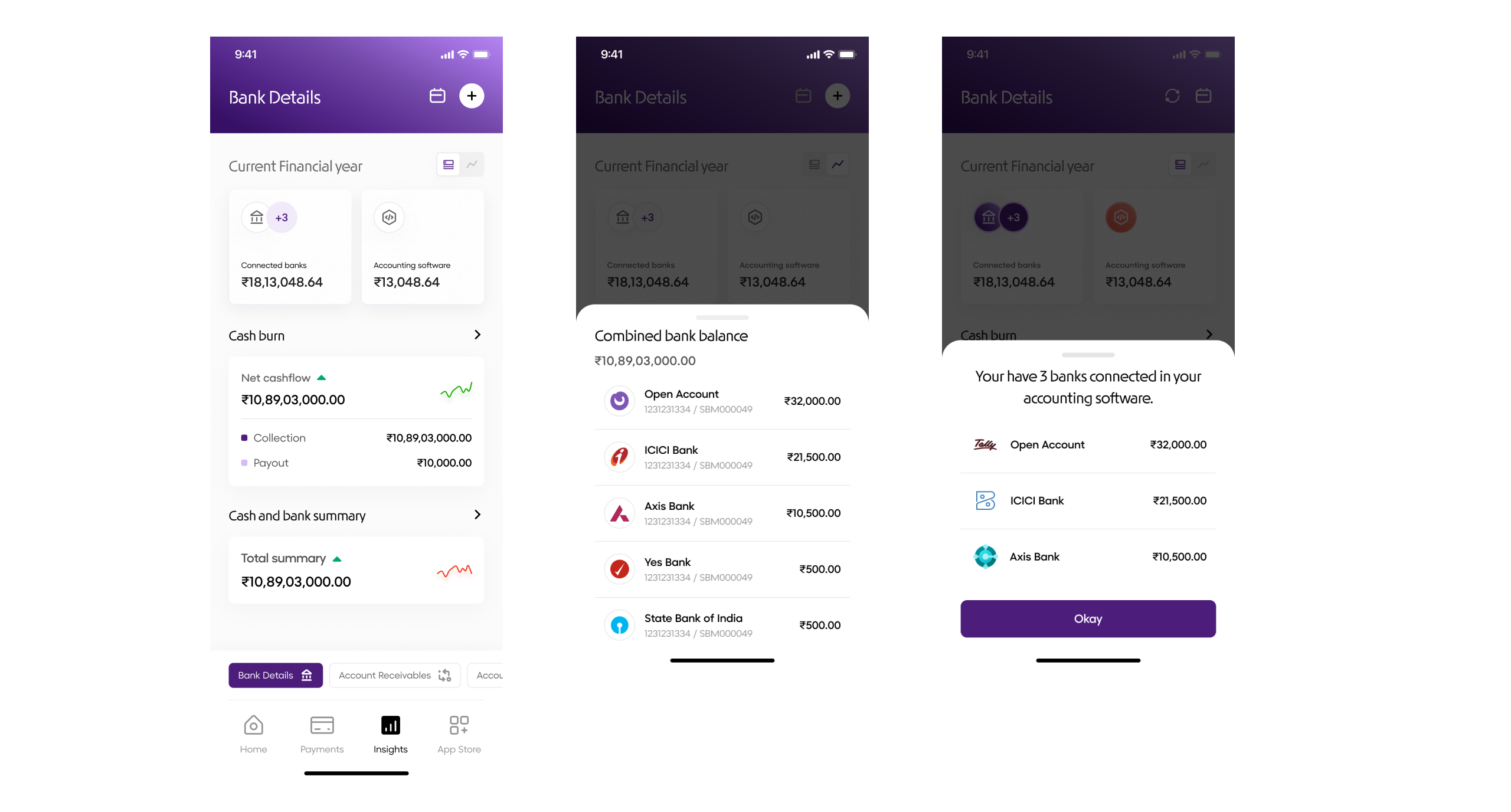
Dashboard
Banking - The banking section became more prominent, as it's the most frequently used feature in the app.
Transaction, pending actions - For improved visibility and easier access
Pin apps - User can add micro apps based on their preference.
Old design
New design
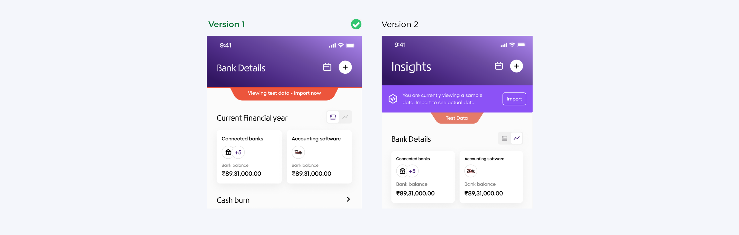
App Store
Improved navigation - Customised navigation where in user can pin the app based on their preference.
Enhanced discoverability - Users are able to discover new feature from App Store.
Easy to access - The submenu is now easily accessible with just one finger for effortlessly.
Old design
New design
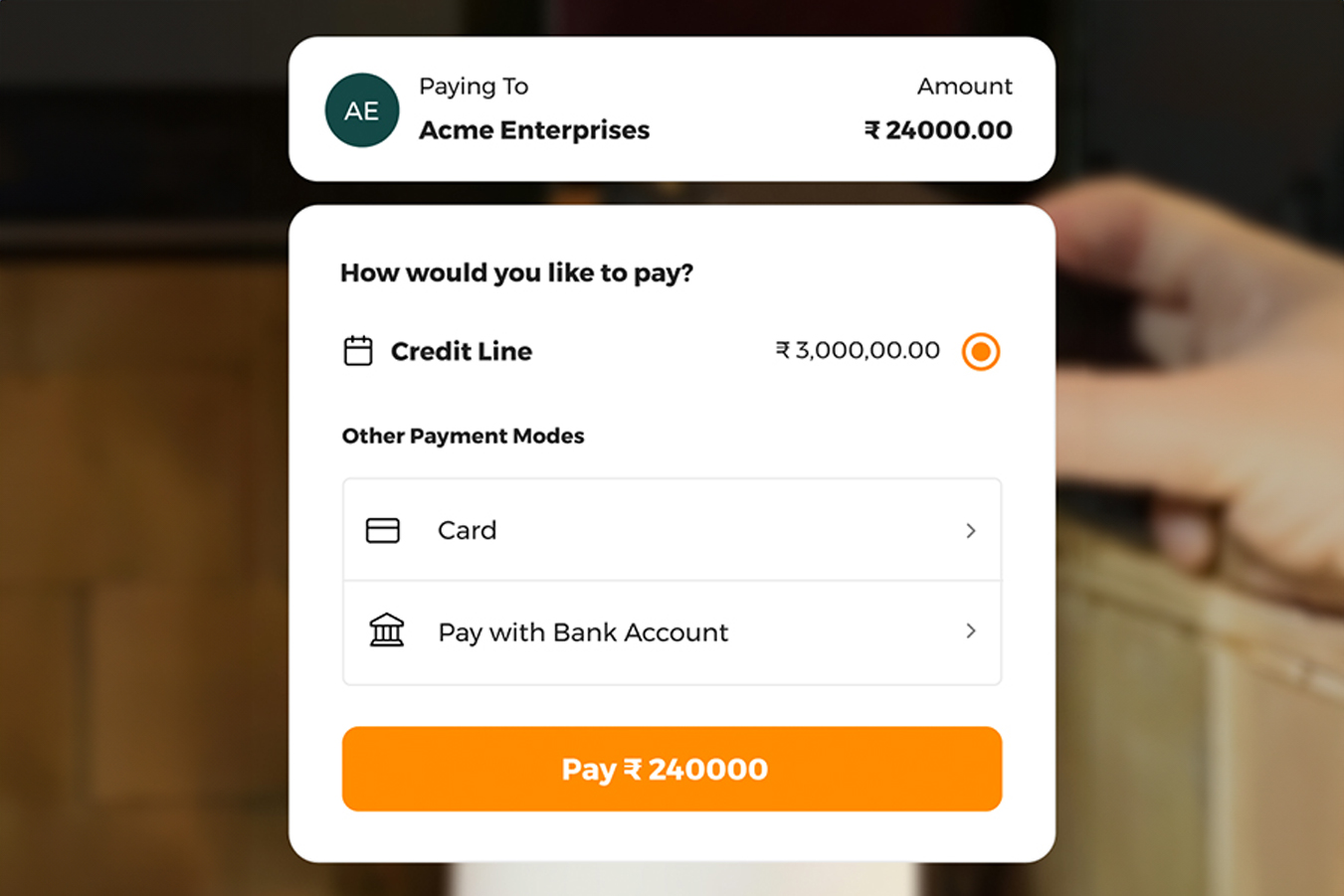
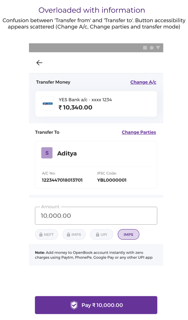
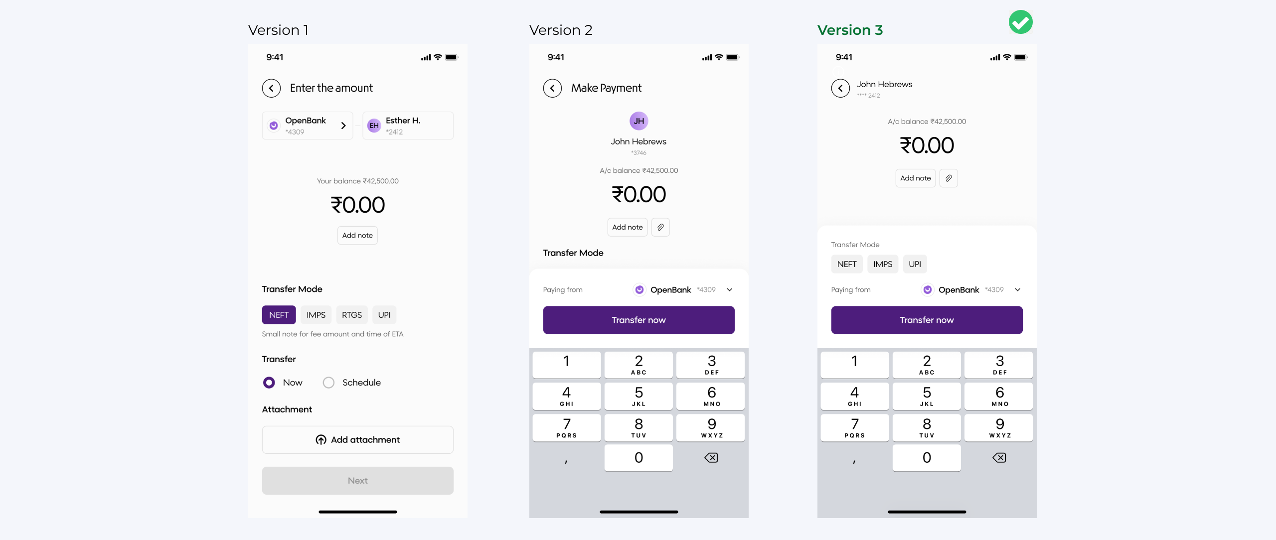
Payment flow
Improved information hierarchy - Re-organised the content.
Added micro interactions - Elegant illustration with micro interactions.
Improved accessibility - Actions can be easily performed with single click.
Old design
New design
Validation: Well-crafted design with clear hierarchy, making it easy to see who the payment is being transferred to and allowing for straightforward changes to the debit bank account.
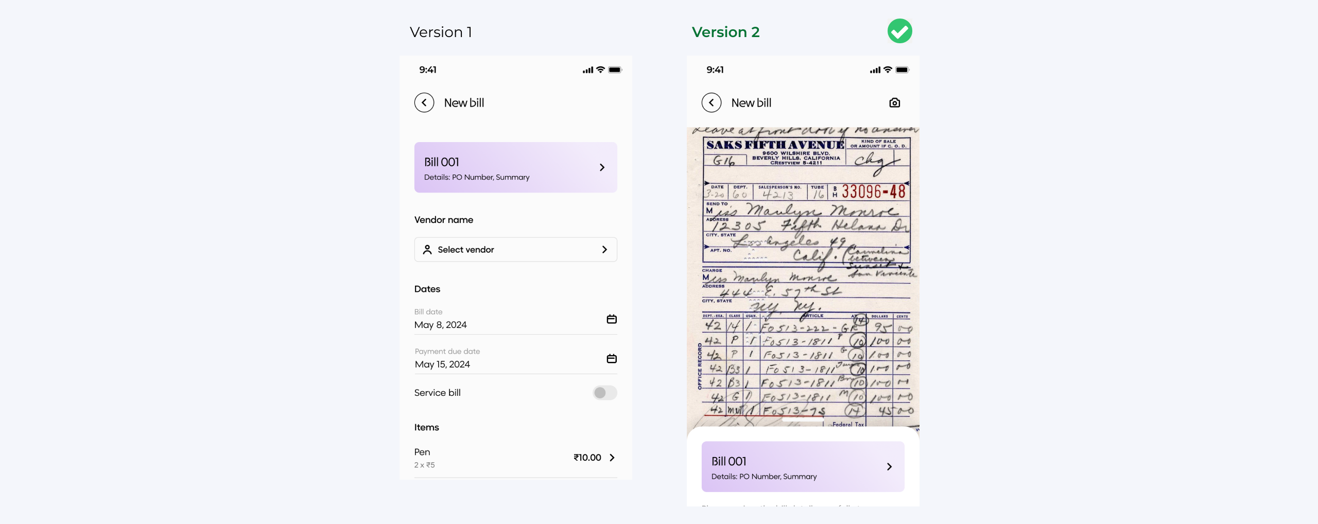
Bill OCR
We’ve added a new feature that allows users to upload invoices, automatically read the information, and convert the bill seamlessly.
Old design
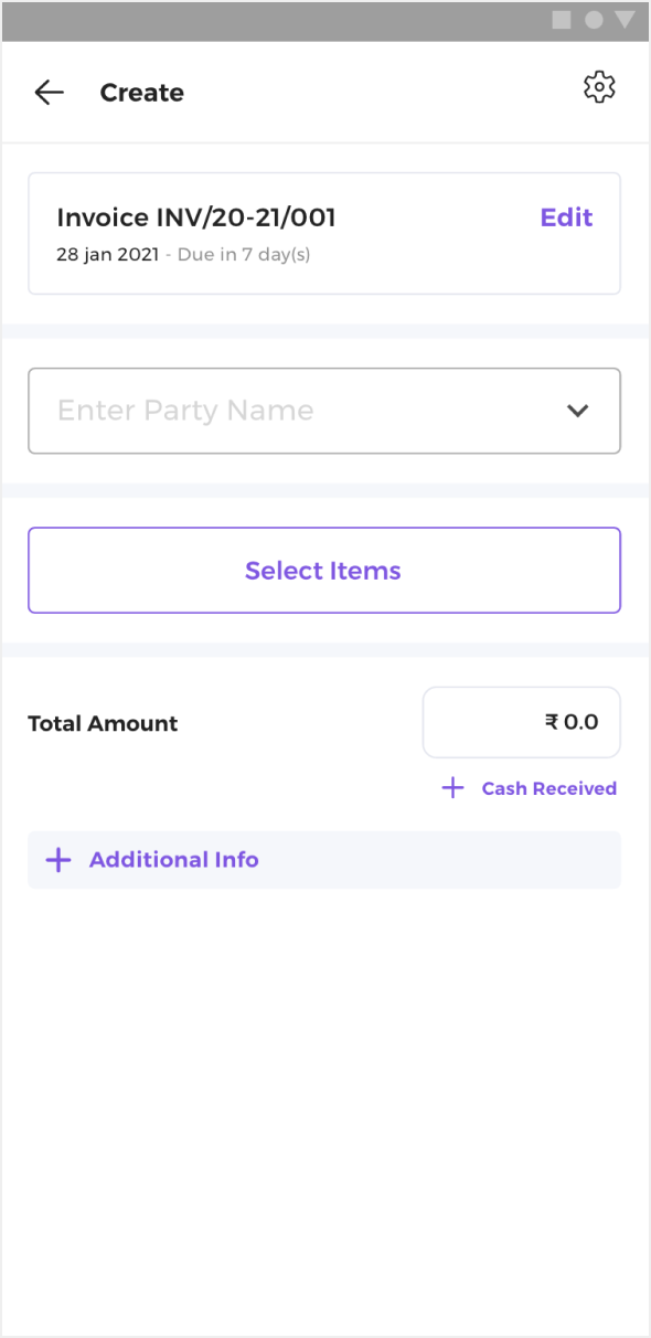
New design
Validation: Auto invoice reading has proven successful, with businesses increasingly adopting this feature.
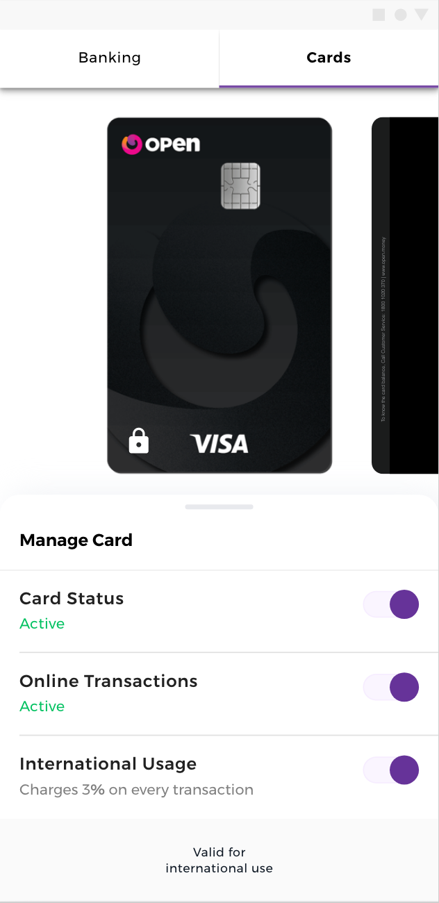
Virtual card
Appealing & Informative - Designed to mimic the look and feel of a physical card.
Security Features - Card number and security code are placed on the back for protection.
Realistic Transitions - Smooth transitions for a lifelike experience.
Old design
New design
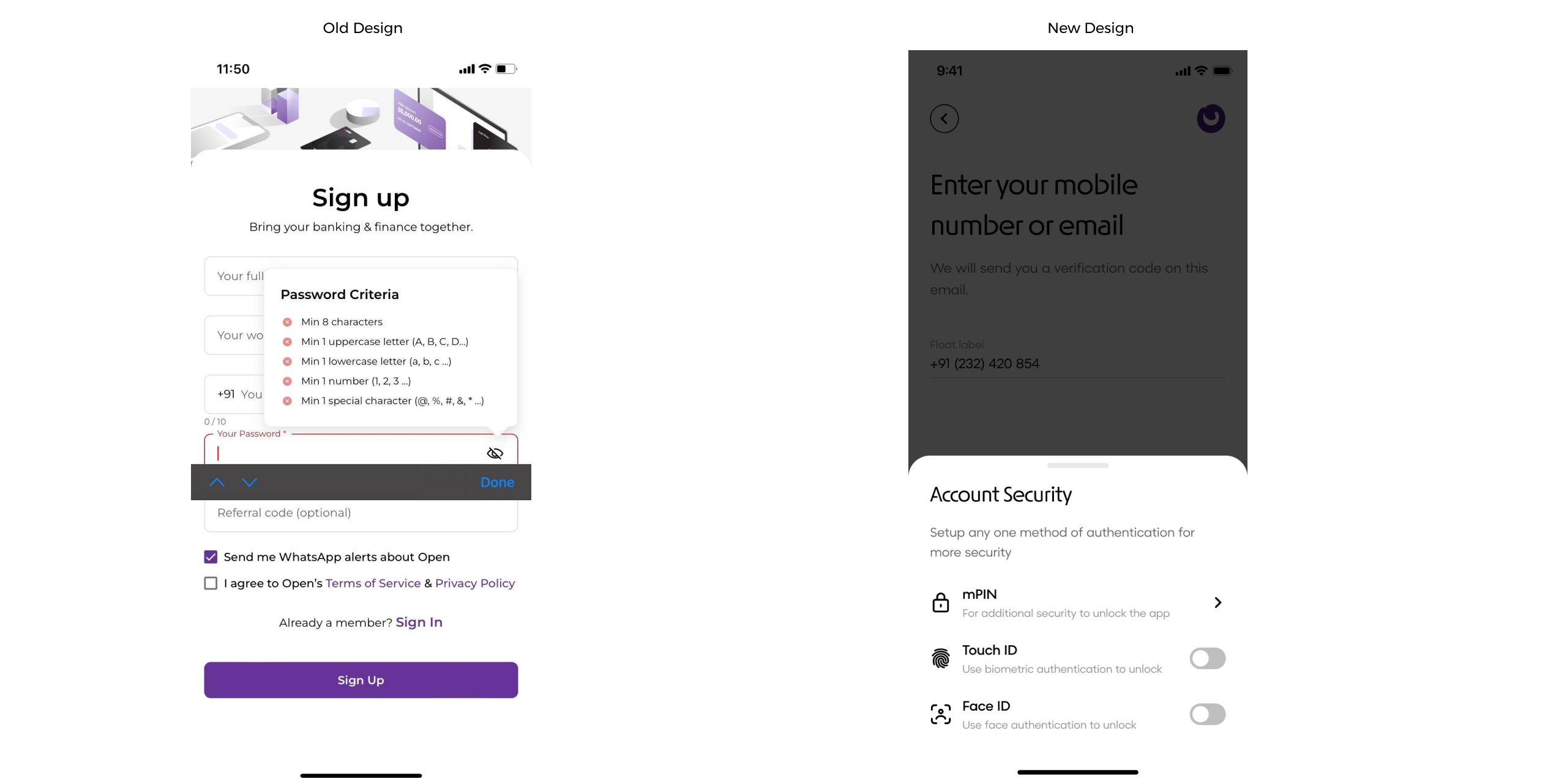
MPIN
Introduced Touch ID and Face ID for easier login.
Users prefer biometric authentication over traditional passwords.
Complex password requirements create friction during signup.
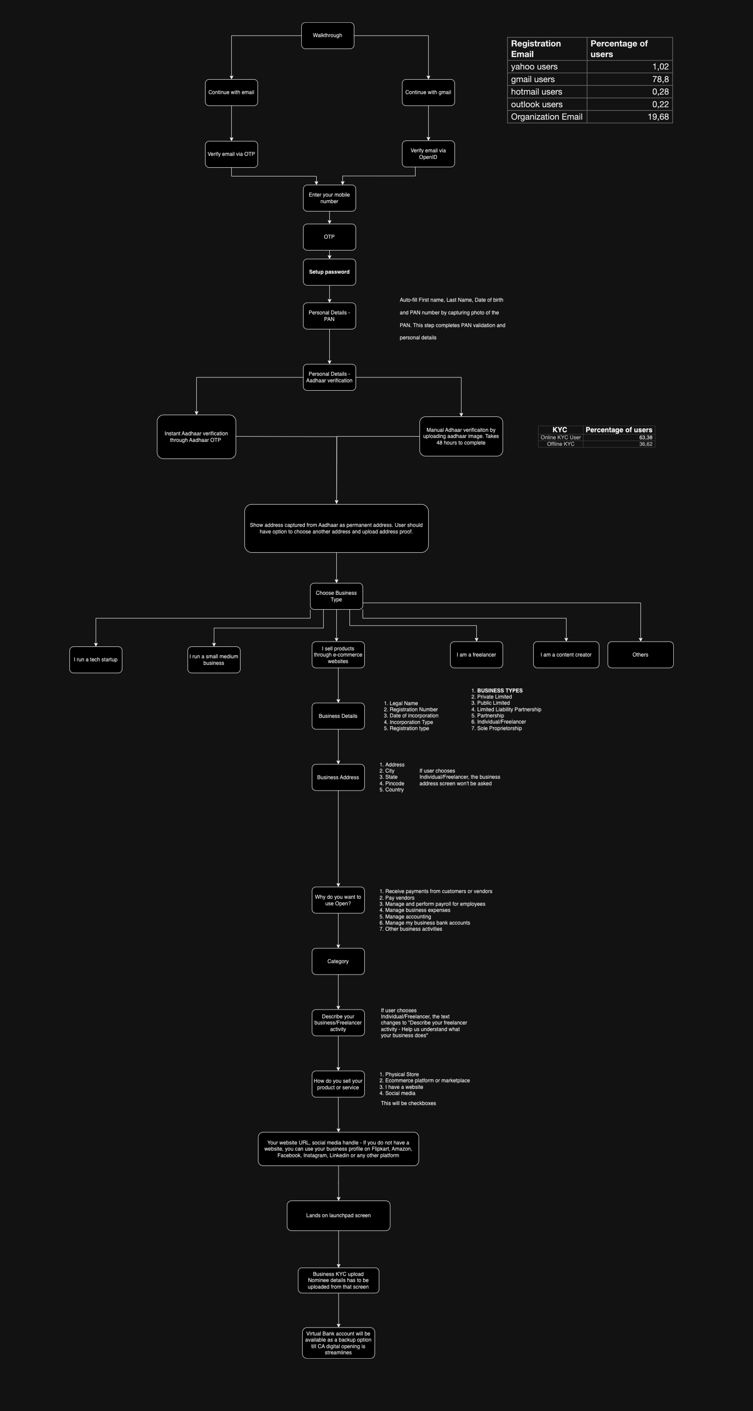
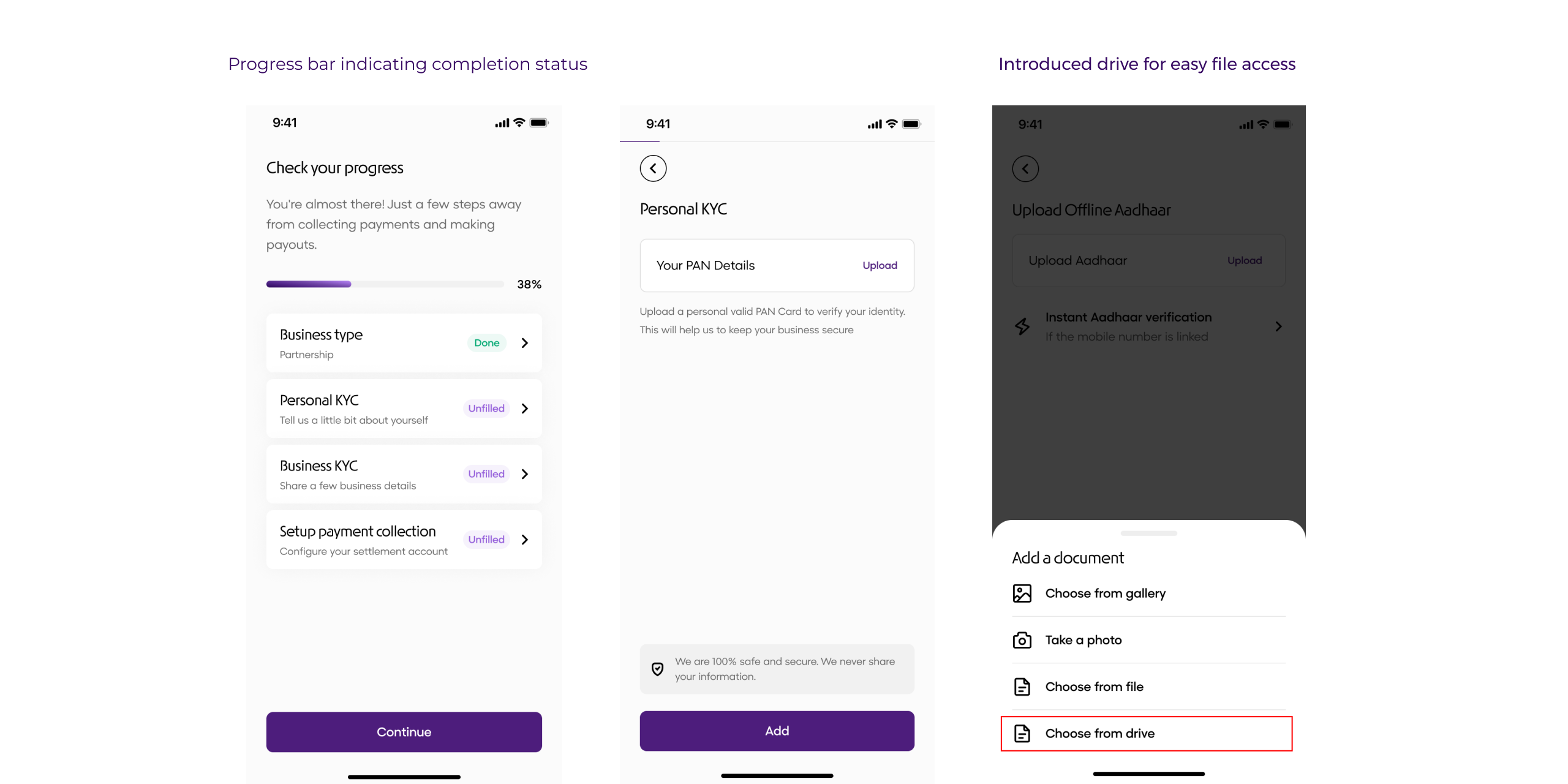
Onboarding process
Included progress bar
Divided the KYC sections 4 better experience
Visibility for documents
Insights
Users can now make informed decisions based on consolidated data from multiple platforms.
Validation: Improved information hierarchy.
A whole Lottie love
Animations were much smoother and the file sizes could be optimised as per the requirement, and it made a big difference overall aesthetic and functioning of the app.
Logo animation
Splash screen animation during IPL
Social media
Results
Customer retention: Increased by 50%.
Churn rate: Reduced by 40%.
Payment initiation: Achieved a 30% Increase.
One of the best parts about data is that it’s almost always possible to collect more. By continuously designing new iterations based on data rather than intuition, I’m able to create superior experiences for users. My focus is on using systematic processes to achieve the most accurate designs informed by real-time data. I believe that combining creativity with data can elevate design to new heights.
You have reached the end!
During this project, I developed my design process and learned that every project presents its own unique challenges. I came to understand that product design is a collaborative process that involves a cycle of feedback and iteration to refine and improve the design.
Through this experience, I gained the confidence to approach any problem with logical reasoning and an appreciation for the various considerations that go into creating a successful and usable design.
Credits
Design : Napoleon and John Hebrews
Product & Development : Naina Bajoria and Eshant

There's more
There's a lot more, in case you are interested in taking a look at in-depth case studies from my previous projects.