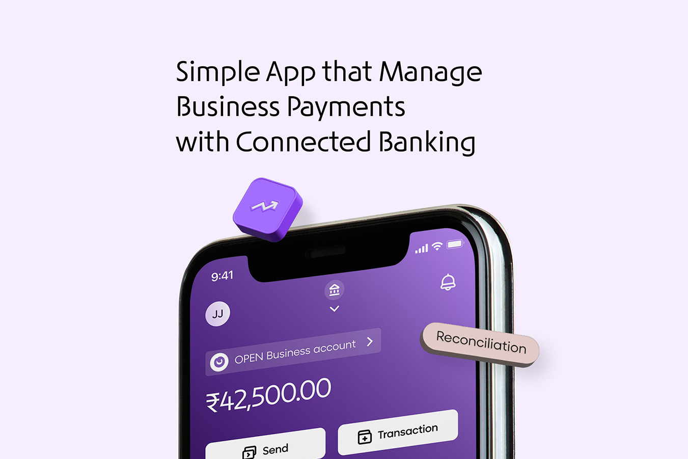
About OPEN Money
OPEN was initially designed to help small businesses and startups manage their business finances effortlessly. However, as our customer base expanded to include SMEs and large enterprises, it brought both exciting opportunities and new challenges.
Businesses had high expectations. They needed more flexibility, faster solutions, and an experience that felt as seamless as the rest of their digital lives. It was clear we had work to do.

The Problem
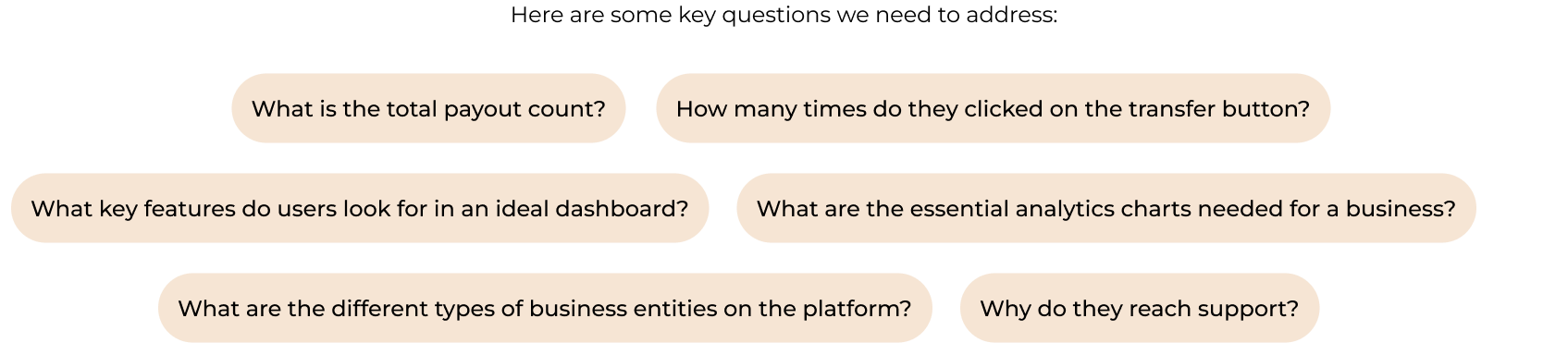
After taking the time to understand the landscape and conduct thorough research, I identified four primary problems that users are facing:
- My dashboard doesn’t make sense for me - Different businesses had unique needs, but our static dashboard wasn’t flexible enough. It forced users into a one-size-fits-all mold that didn’t work for everyone.
- Why is payout so hard to use? - We saw a 40% decline in payout transactions, a core part of our revenue stream. Customers were finding it complicated and switching to alternatives.
- I can’t collect payments the way I want - Businesses were unhappy with the lack of options for collecting payments.
- I need help every step of the onboarding journey - More than 30% of support calls were tied to onboarding frustrations. Customers were struggling to set up their accounts, and our support team was stretched thin.
The Process
Research conducted internally shows that most of small business banking customers have no more than 3 accounts, have around 10 transactions per day, and may need to initiate and/or approve around 10 payments and/or transfers per day.
Corporate banking customer have more transactions operations: depending on the size of the company, more than 7 accounts is usual for that segment, with dozens of daily payments, transfers, and approvals.
According to the insights resulting from previous usability testing activities, users of similar platforms seek clarity of information, with particularly a preference of easy to use and readability. Also, card sorting activity showed that users are expecting to have the following categories in the 1st level of navigation: Dashboard, analytics, receivables, payments, reports and banking.
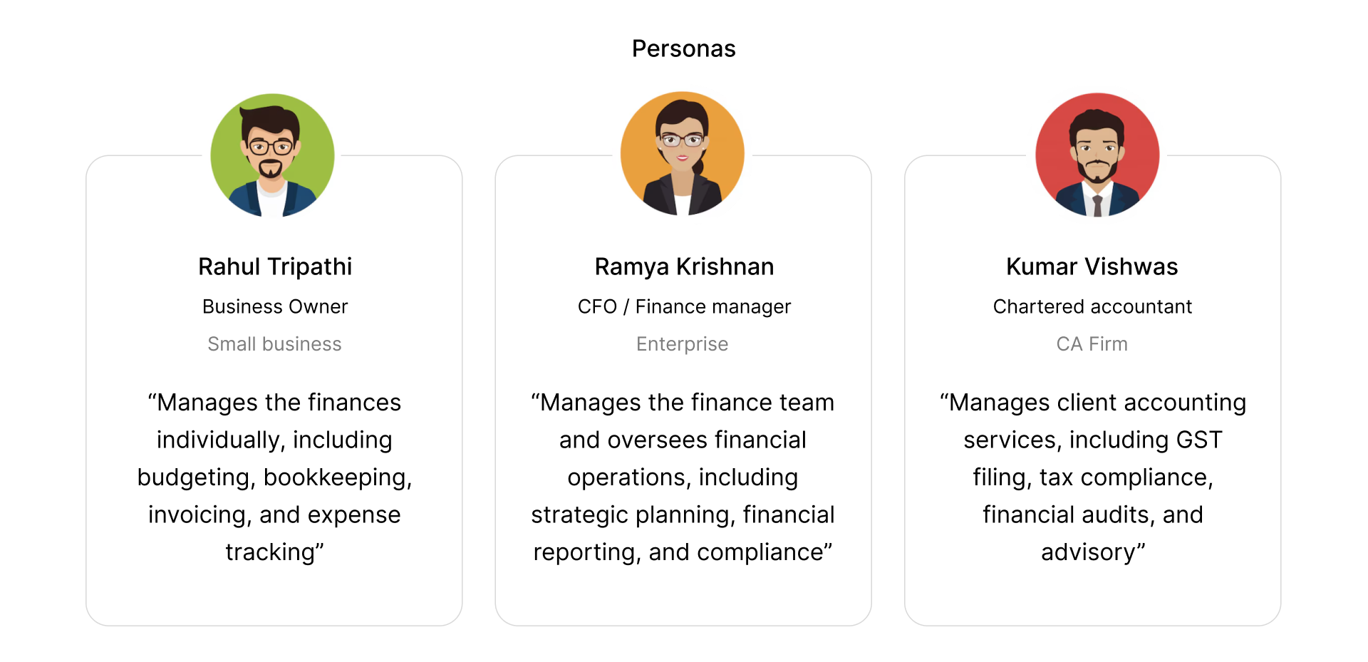
Based on shared attitudes, goals, pain points, and expectations of the platform we segmented users into three personas, and mapped all the thoughts, emotions, experience to different stages of their user journey.
First thing we did we talked to the our internal finance team and gathered all the informations and listed out. Also we checked our analytical tools to validate the data and which features are mostly users are struggle to use. We conducted primary and secondary research with a medium-to-large sample size.
Action
The redesign addressed fundamental usability challenges, resulting in the following enhancements:
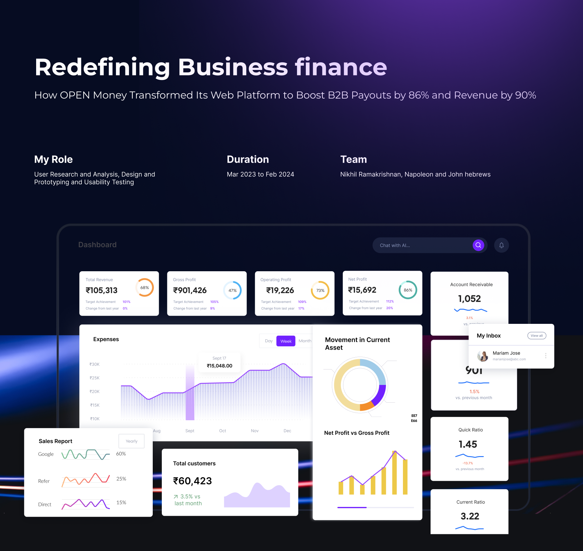
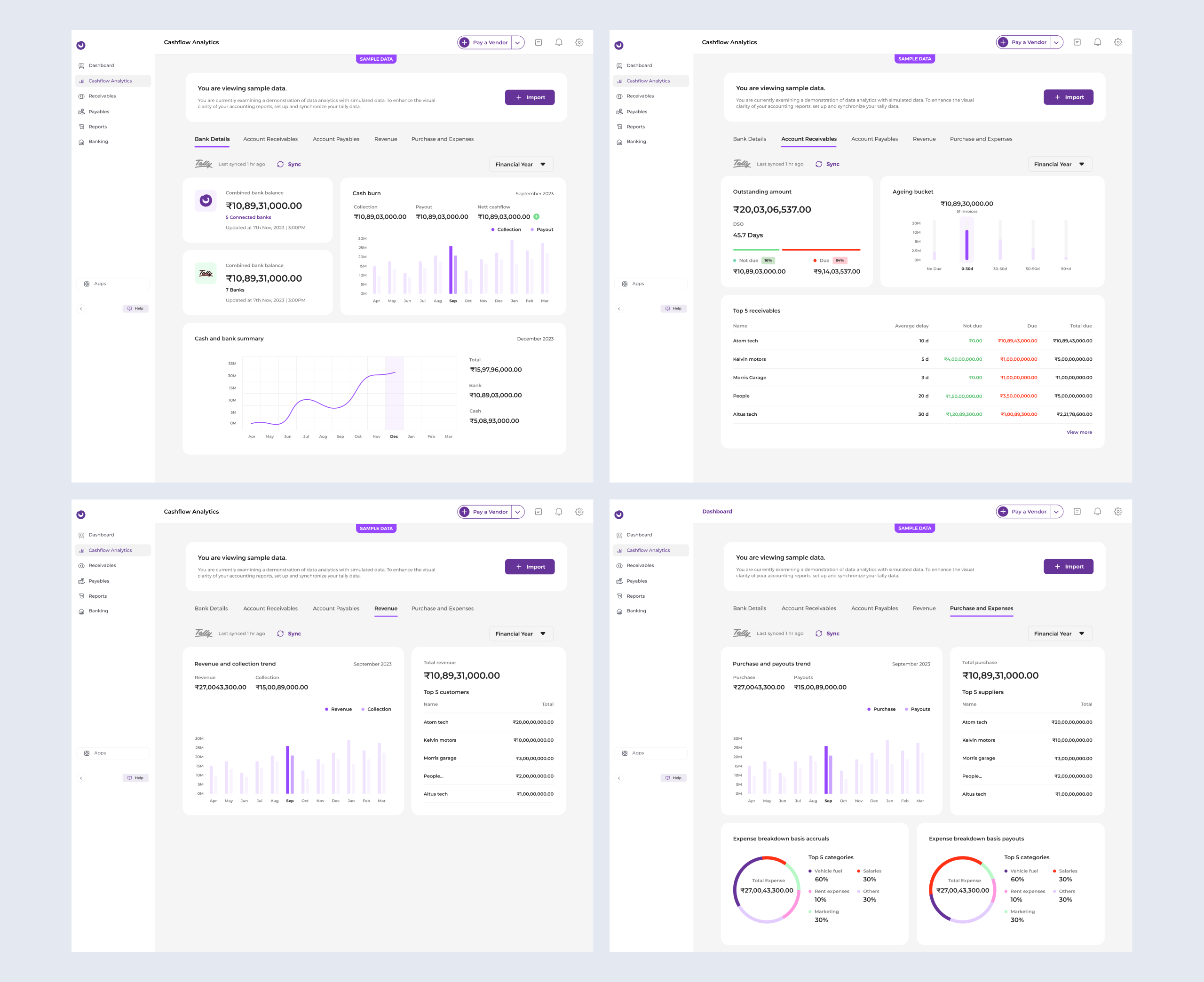
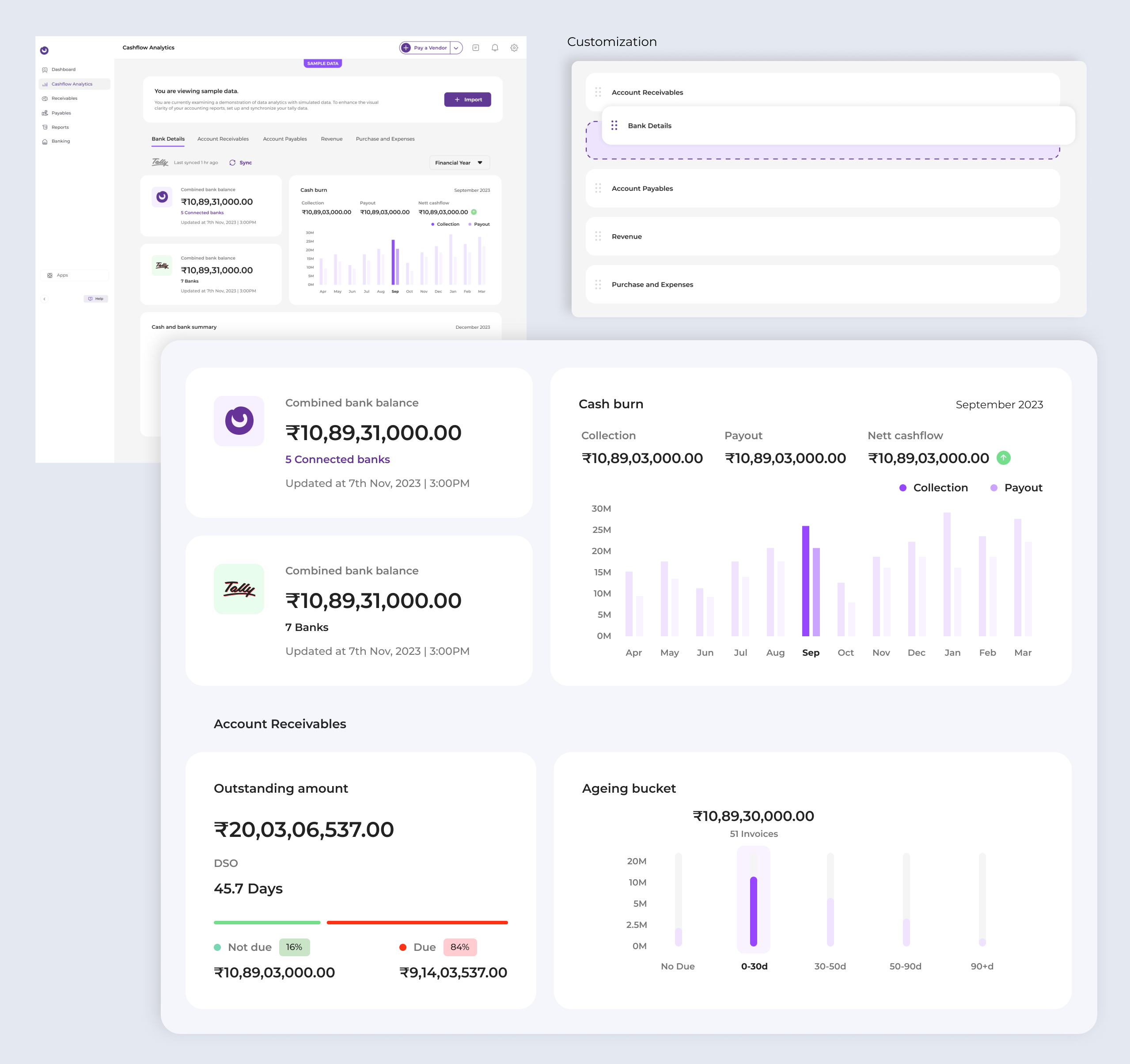
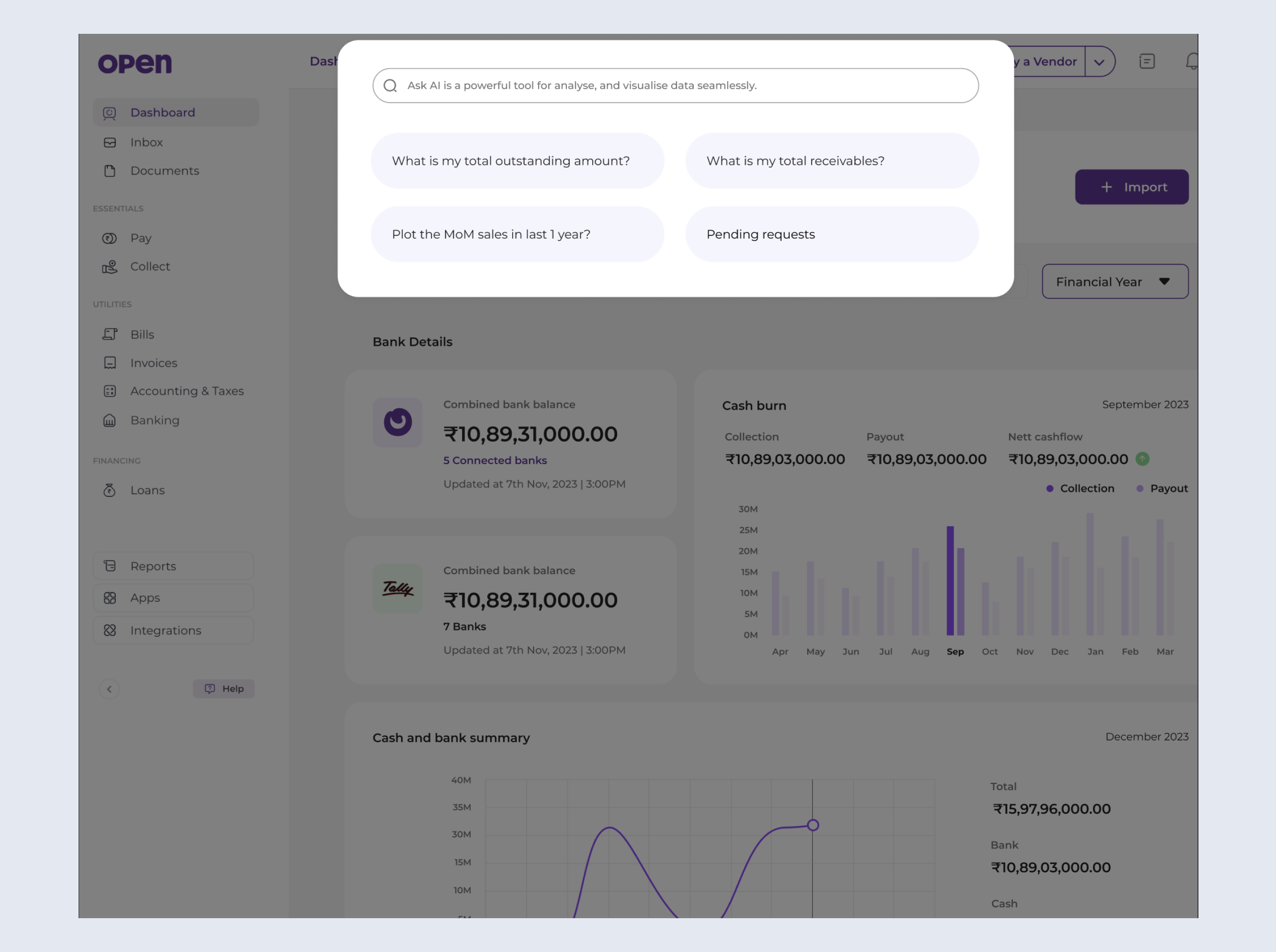
1. Cashflow Analytics
Informed decisions - Statistics empower businesses to make informed decisions and forecast financial growth.
Customization - Users can personalize their widgets to suit their preferences.
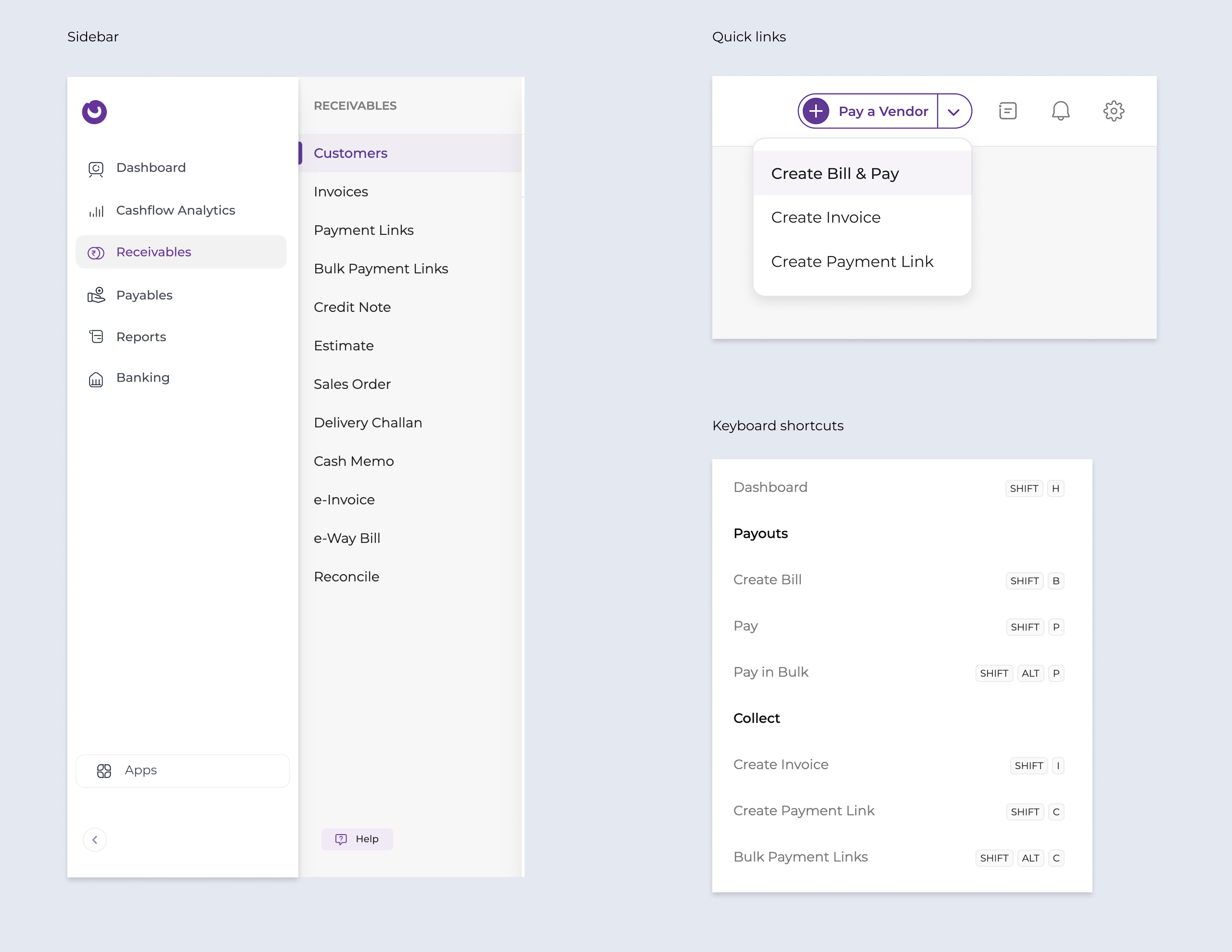
2. Navigation
Sidebar - Made frequently used features accessible within two clicks
Quick links - Seamless access to frequently performed actions, customized to user behavior, directly from the header.
Keyboard shortcuts - Accountants prefer keyboard shortcuts for seamless navigation between fields.
Ask AI - The AI search feature enables users to find relevant information with a single click.
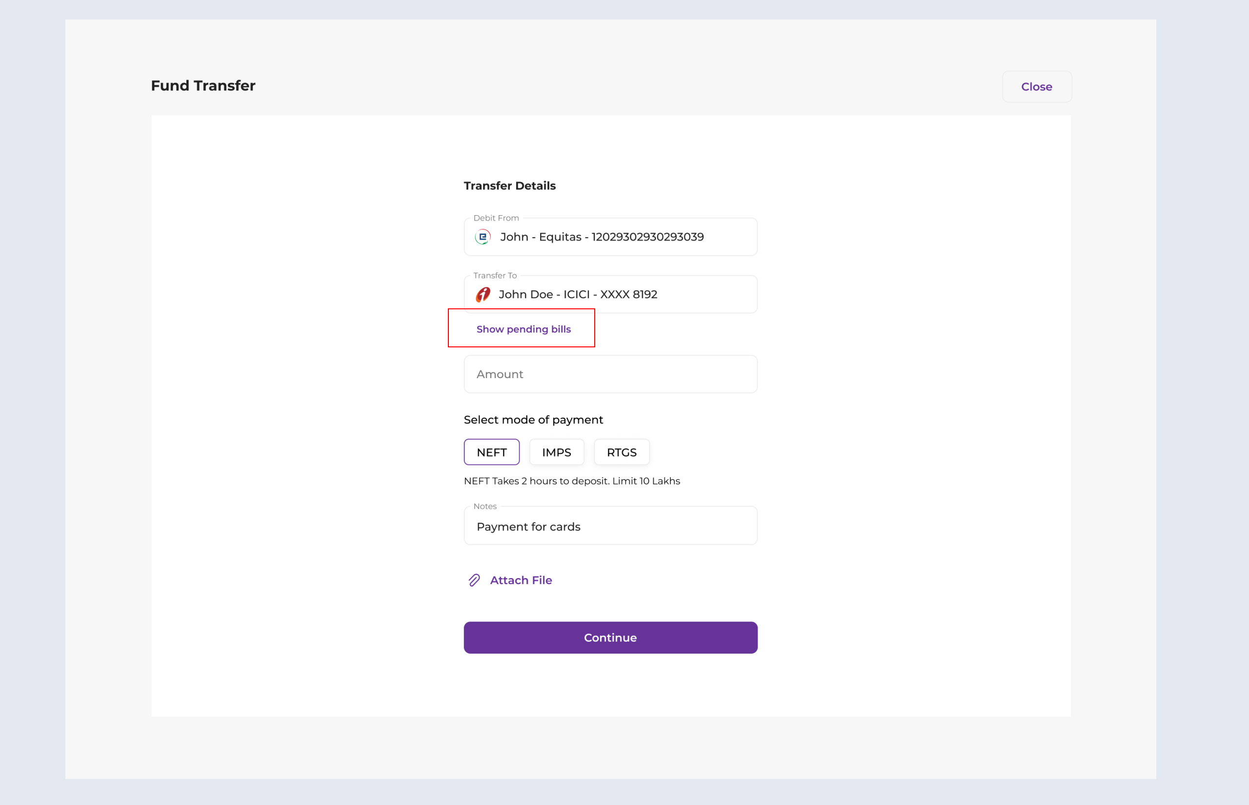
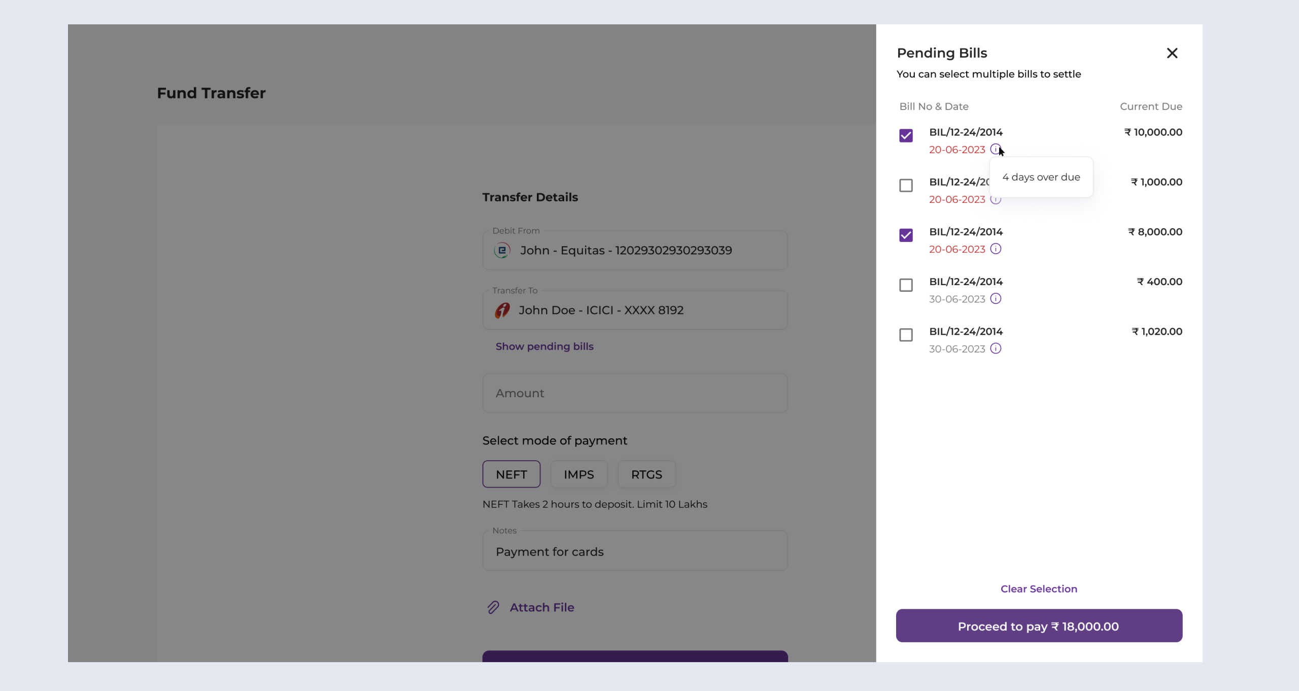
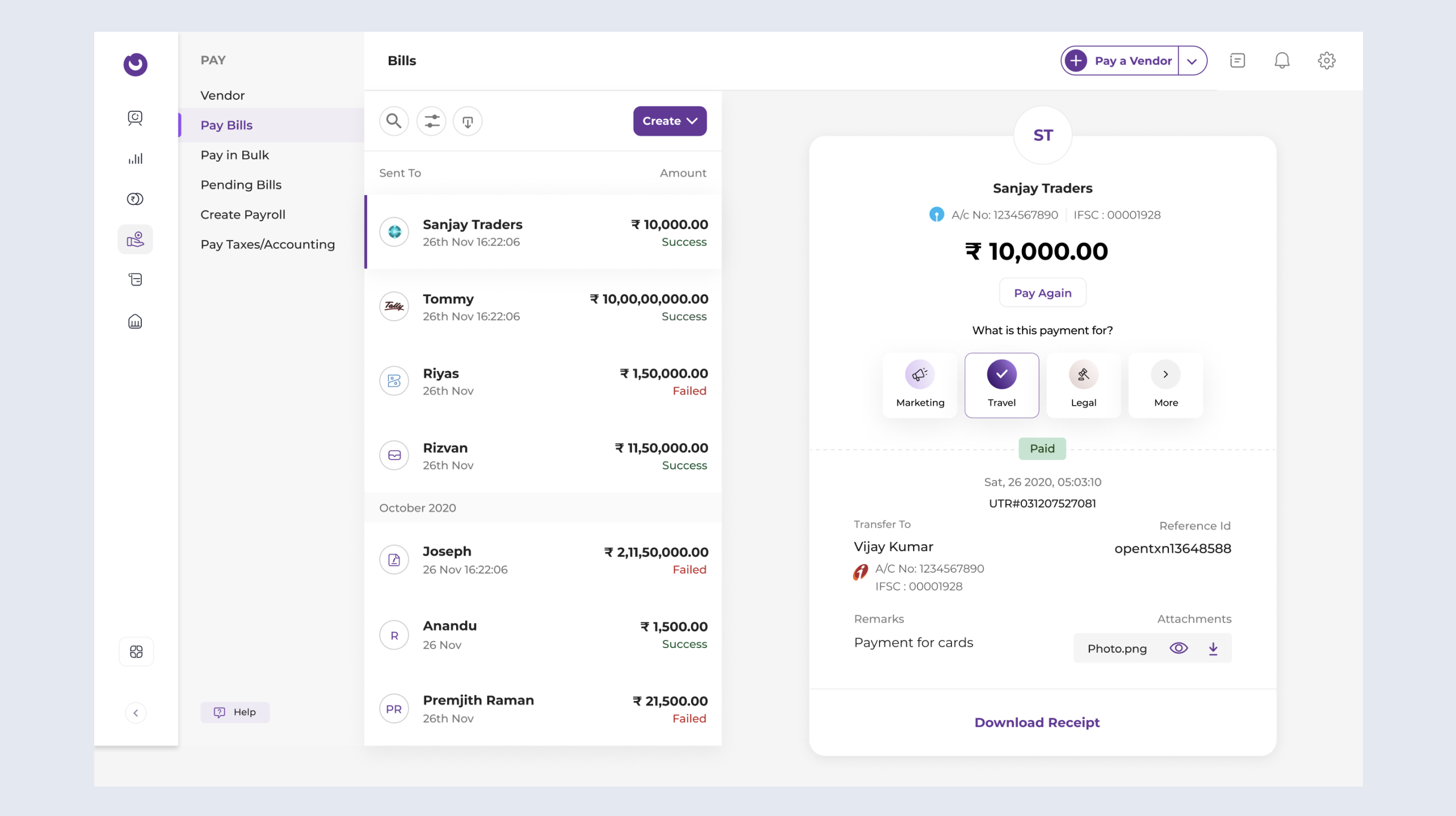
3. Payment flow
Improved accessibility - Actions can be easily performed with single click.
Pending bills - Displaying pending bills helps businesses settle all outstanding payments in one go.

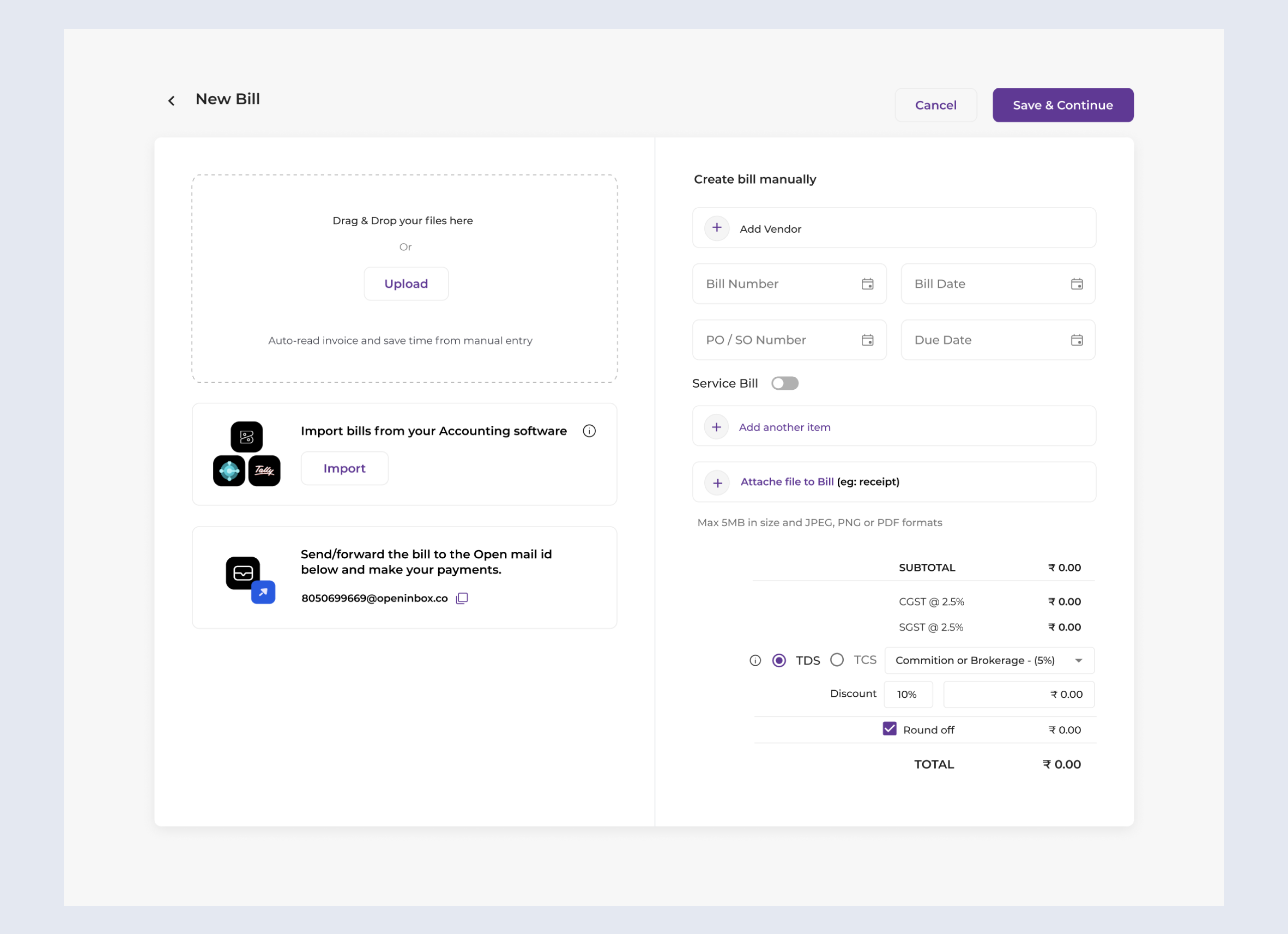
4. Bill payment
OCR - Upload invoices, automatically read the information, and convert the bill seamlessly.
Bulk Bill - Import bills, pay via OPEN, and auto-sync data.
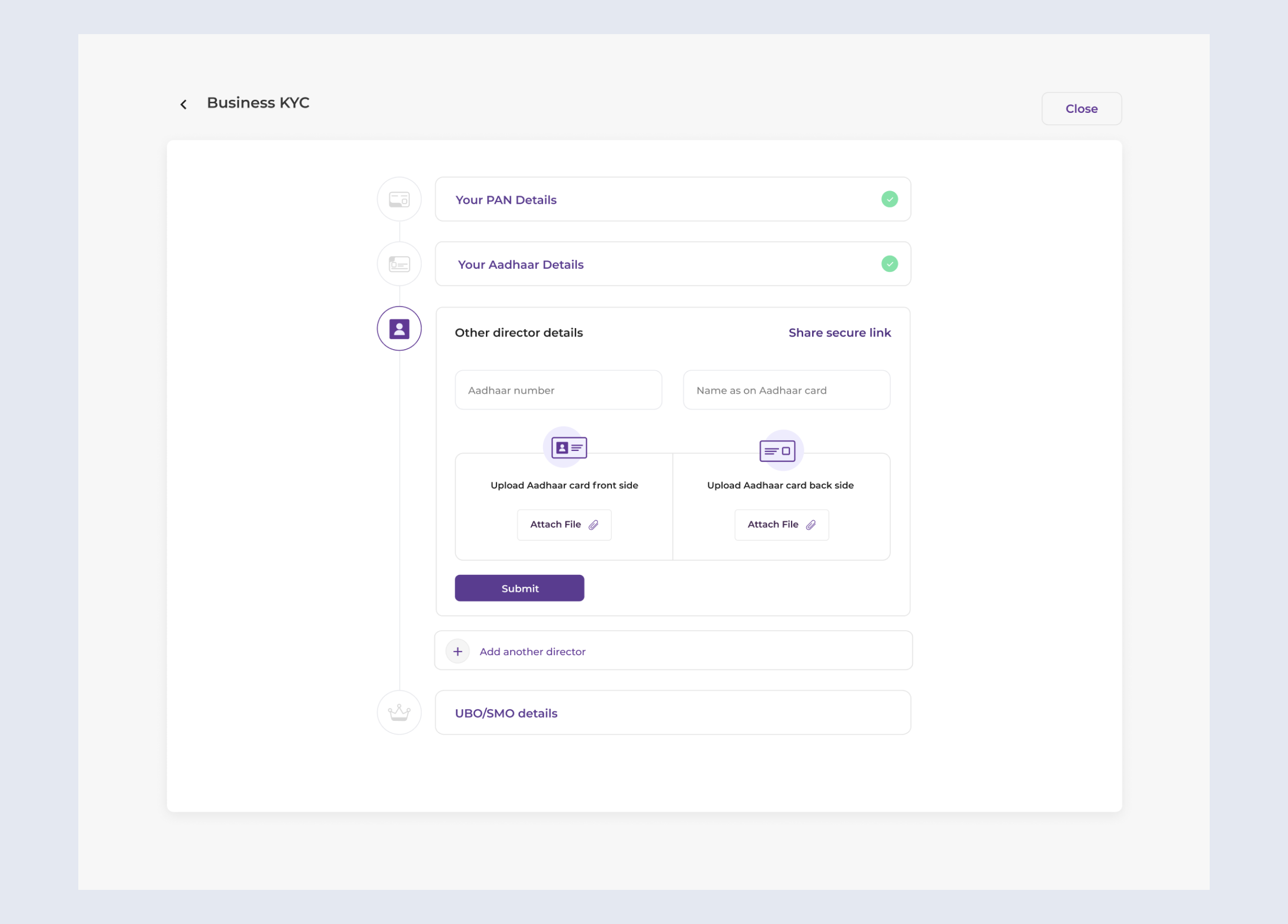
5. Onboarding
Step-by-step process - To minimize confusion during onboarding, we implemented a step-by-step process, complemented by help texts and introductory videos to guide users through each stage.
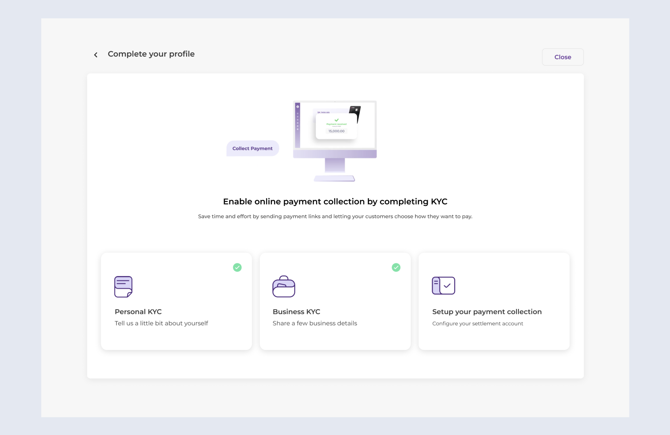
Maintaining privacy - Our research showed that most queries came from partnership firms needing multiple directors to upload documents, often causing delays. To solve this, we introduced a secure shareable link, allowing directors to upload documents independently while maintaining privacy.
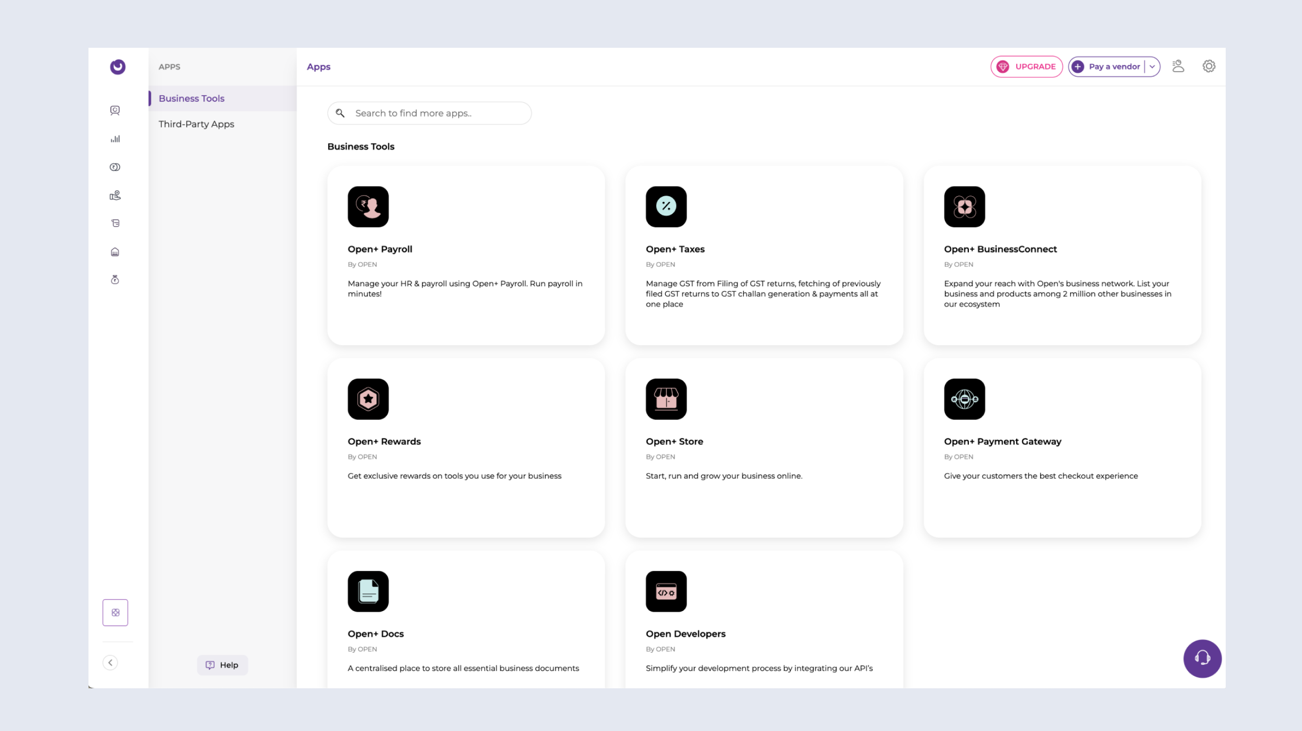
6. App Store
Enhanced discoverability - Users are able to discover new feature from App Store.
Results
The redesign delivered measurable success across multiple fronts:
1. 86% Reduction in Assisted Onboarding: The intuitive design and self-help tools empowered customers to complete the process independently.
2. 90% Growth in Subscription Revenue: The simplified onboarding and enhanced usability drove higher retention and new customer sign-ups.
3. Happier Customers: User satisfaction scores improved significantly as businesses found it easier to use the platform and unlock its full potential.
There's more
There's a lot more, in case you are interested in taking a look at in-depth case studies from my previous projects.